

BMPP
BMPP, aka Building More Philanthropy with Purpose, aka Bad Mo Pho Phamily, a Twin Cities-based giving circle came to us ten years ago with a mission to change the way philanthropy was viewed and who could be considered philanthropists. The circle is a group of families that gather to pool their resources and give micro grants to community projects through a simple application process that removes the barrier of often strenuous and inaccessible grant application processes.
At that time we created an identity that embodied this spirit of rebellion and helped establish BMPP as an organization that does things radically different. The brand was bold and defiant and so full of swagger that our t-shirts were banned in school. There was still a need for a look that felt more “professional” when interacting with traditional establishment philanthropy and non-profit organizations, and so the identity was split into two distinct looks.
After 10 years, $300,000 gifted, and over 60 projects funded, we set out to consolidate that initial dual branding into one singular identity and fully embrace the defiant and radical spirit of the Bad Mo Pho Phamily.
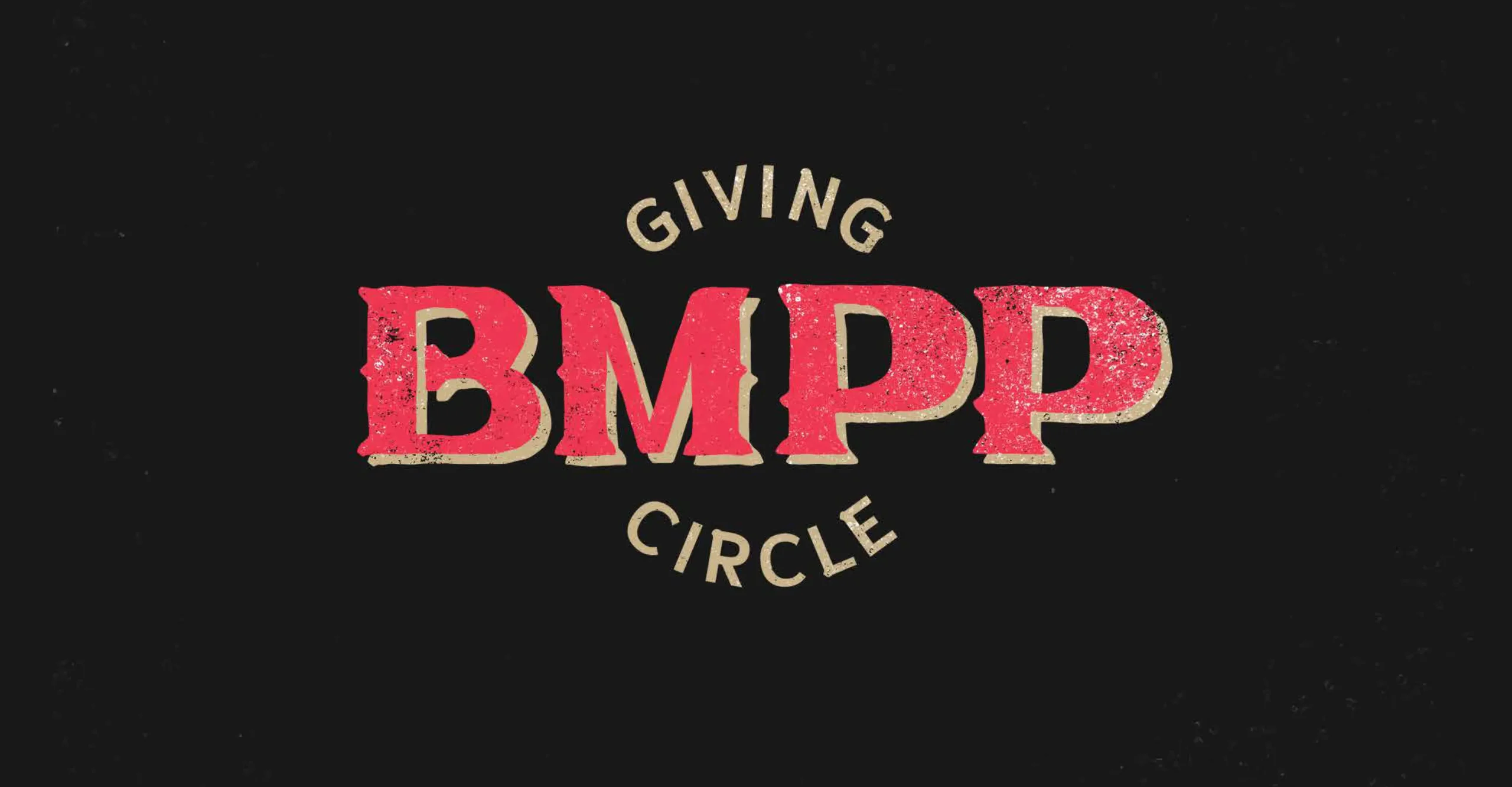
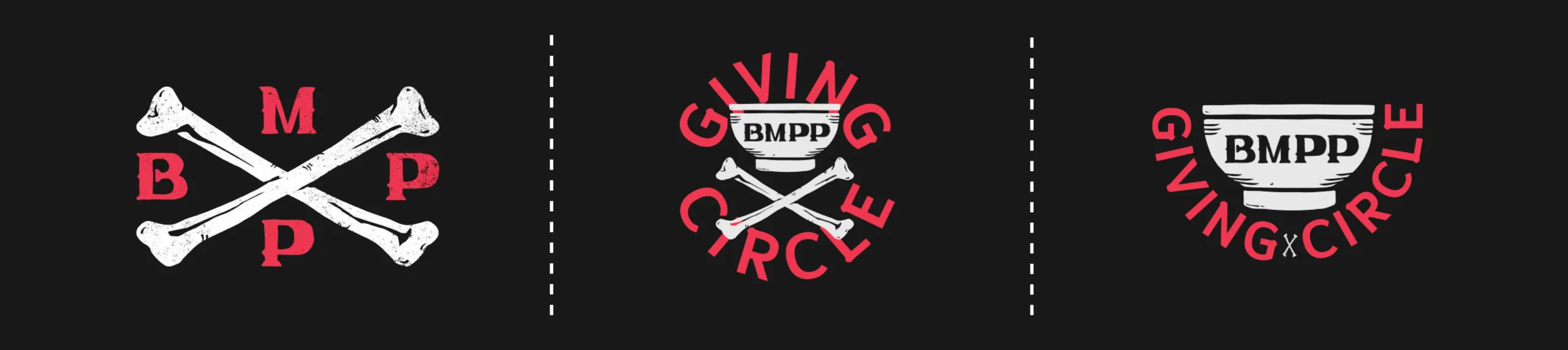
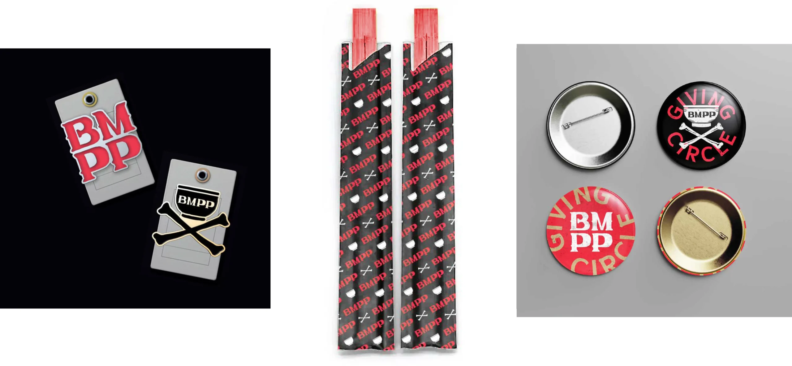
We started by creating custom lettering for the BMPP initials that were inspired by Pho shop signs throughout Southeast Asia and then adopting the image of the Pho bowl as a symbol of abundance, nourishment, family, and community and also as nod to the group’s main celebration event which is a communal Pho meal.
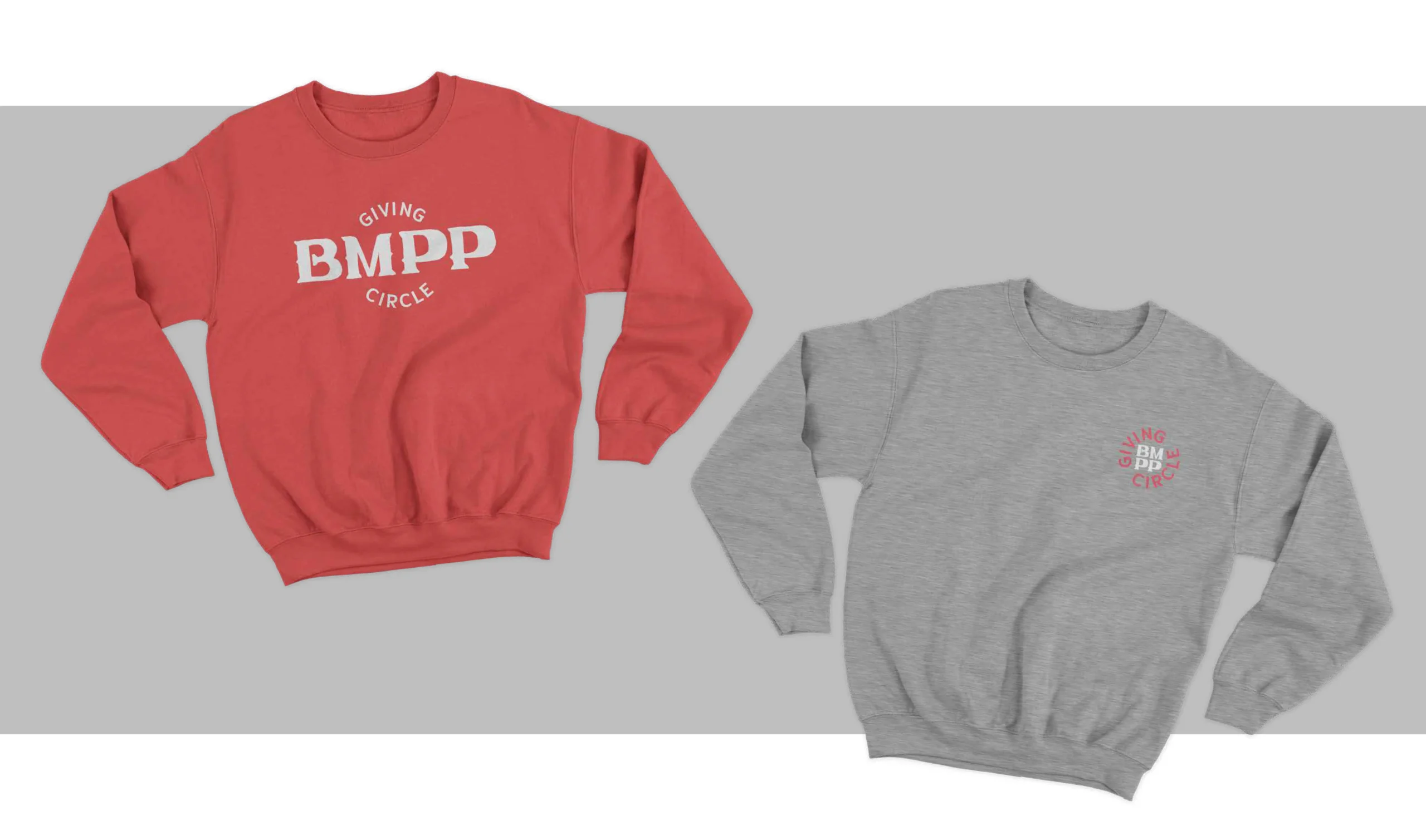
We then took this Pho-related iconography and created an identity inspired by anti-establishment movements like punk, tattoo art, and graffiti. The result is a brand that is flexible, being brash and bold when it wants to be, and understated when it has to be, all while standing out among other giving organizations.